Shantapan: A Bold Display Font for Modern Web Design
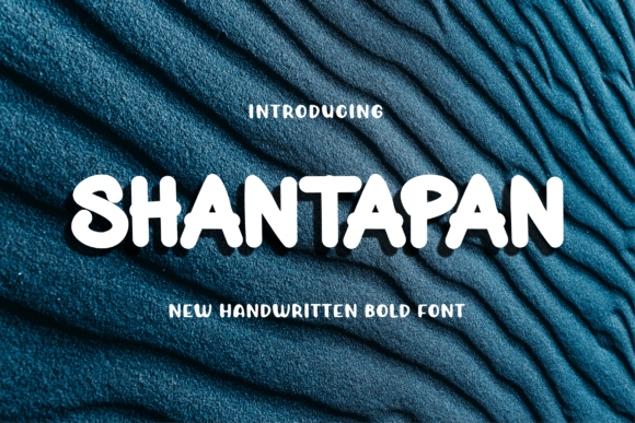
As a UI designer who builds landing pages, SaaS dashboards, and conversion-focused e-commerce experiences, I choose display fonts not just for style—but for function. Shantapan stands out because it delivers bold presence without sacrificing authenticity or digital legibility. It’s a modern display font built for impact: strong letterforms, balanced spacing, and a confident rhythm that reads well at scale—even on mobile viewports.
Visually, Shantapan combines geometric structure with subtle humanist warmth. Its uppercase letters command attention in hero sections, while its lowercase forms retain clarity in shorter headings or CTA buttons. Unlike overly condensed or decorative display fonts, Shantapan avoids visual noise—making it ideal for interfaces where hierarchy must be instantly readable. It’s not a script or serif font; it’s a purpose-built display typeface that works where typography needs to anchor tone *and* guide action.
Where Shantapan Performs Best in Digital Layouts
In practice, Shantapan shines in high-impact zones where users make quick decisions:
- Hero section headlines—paired with a clean sans serif body font (like Inter or Manrope), Shantapan creates immediate contrast and sets brand voice before the first scroll.
- Landing page CTAs—its bold weight ensures “Get Started” or “Join Now” buttons stand out without relying solely on color or size.
- Online store banners—especially for creative brands, boutique fashion, or indie game studios (e-sports branding included), Shantapan adds authority without stiffness.
- Course sales pages and webinar headers—its confidence supports premium positioning, helping visitors associate clarity and professionalism with your offer.
- Portfolio site section titles—when designers or developers showcase work, Shantapan frames projects with intention—not distraction.
It’s less effective as body copy or small interface labels. Reserve it for short, strategic text: logos, section headings, button labels, social media cover graphics, and branded email headers. That restraint is what makes it powerful—it doesn’t compete with content; it curates attention.
Readability & Responsiveness: Practical Considerations
On desktop, Shantapan scales cleanly from 32px up to 96px+ for full-width hero text. On mobile, I recommend using it at no smaller than 28px for headings—and always test with real device previews. Its generous x-height and open counters help maintain legibility even at reduced sizes, especially against solid backgrounds.
For dark mode layouts, Shantapan holds up well with light text (e.g., #FFFFFF or #F0F0F0), but avoid thin white strokes over busy image overlays—opt instead for subtle text shadows or semi-transparent background bars. On light backgrounds, it pairs naturally with mid-gray body text (#4A5568) for accessible contrast.
Smart Font Pairing for Web Projects
Shantapan thrives when paired with functional, highly legible fonts. My go-to combinations:
- Sans serif pairings: Use Inter, Poppins, or Work Sans for body copy, navigation, and form fields. Their neutral geometry lets Shantapan lead without clashing.
- Serif accents: For editorial-style blogs or premium course sites, try pairing Shantapan headers with a refined serif like Lora or Playfair Display—just keep serif usage limited to pull quotes or bylines to preserve hierarchy.
- Avoid pairing with other bold display fonts or scripts. Shantapan’s personality is distinct enough to carry the visual load on its own.
Licensing, Formats & Real-World Integration
Before deploying Shantapan across client websites or your own digital products, verify licensing terms. As a commercial font, it typically includes WOFF2 and WOFF webfont files—essential for fast loading and cross-browser support. Check whether the license covers web embedding (via @font-face), SaaS applications, online stores, and template resale—many premium display fonts restrict usage in editable design assets or white-label tools.
If multilingual support matters for your audience (e.g., European languages or extended Latin characters), confirm glyph coverage early. While Shantapan is optimized for English branding, some variants include accented characters and punctuation needed for broader regional use.
Building Consistent Digital Identity
Consistency isn’t just about using the same font everywhere—it’s about applying it with intention. On a coaching website, Shantapan might define the main headline and testimonial quote attribution, while a lighter sans serif handles session descriptions and scheduling buttons. In an online shop, it anchors category banners and limited-time offer tags—never product names or price labels.
This discipline strengthens perceived brand trust. Users subconsciously register rhythm and restraint as signs of thoughtful design. When Shantapan appears only where emphasis is earned, it reinforces credibility—not decoration.
Whether you’re refreshing a portfolio, launching a new app, or optimizing a checkout flow, Shantapan offers more than aesthetic appeal. It’s a tool for shaping perception, guiding attention, and reinforcing message hierarchy—all within the constraints and opportunities of the modern web. Used intentionally, it becomes part of your design system—not just an asset you drop into Figma and forget.